No, dinner is for everyone on the table!

A wide range of actors contribute to OpenStreetMap (OSM) with varying backgrounds and skills. Inclusive visualisation of data quality in OpenStreetMap (OSM) can elevate the motivation and understanding of the data creators. We visualise the quality or state of the data, so that it could be improved. So, to convert this visualisation into an actionable intervention we land in another cartographic challenge. With this proof of concept I tried to use what I call “inclusive visualisation” and apply it to two case-studies in the Caribbean Islands. Inclusive (geo)visualisation shows that “there is always another way” to make the best out of the different dimensions of the regional contexts beyond the impending disaster.
I tried 2 to 3 ways to visualise the quality of OSM for two of my case studies. For first case-study I visualise the missing building footprints in three different ways. For the second case-study I visualise buildings with less than one tag in two different ways. These visualisations help multiple stakeholders to understand the visualisation in an action based way.
No, dinner is for everyone on the table! - Inclusive Visualization
Visualisation of the state of the data is very challenging especially when different stakeholders are involved. With this project of inclusive visualisation, I try to visualise the quality (state) of OpenStreetMap (OSM). There are alot of contingencies when it comes to understanding the state of the data. For instance what should be perceived by the users, how to proceed and what interventions could be followed. The action-based interventions can be easily concluded if the visualisation is perceptually uniform for all the stakeholders. In order to understand further, there are always epistemic gaps amongst different stakeholders when it comes to data visualisation, let alone the visualisation of state of the data which is challenging on its own.
Other than making the visualisation “Understandable for All” there is another contingency that arose due to some ethical conundrums. These include the perspectives from critical (geo)data/Cartography and geo-ethics, which is to facilitate the principle of “do-no-harm”. This means that no harm should be done intentionally or unintentionally to the population whose data-doubles are being addressed, while producing such visualisations. Finally, to make the visualisation more perceptually uniform for physically impaired people such as colour blind. Addressing these challenges will lead towards inclusive visualisation of data quality of OSM.
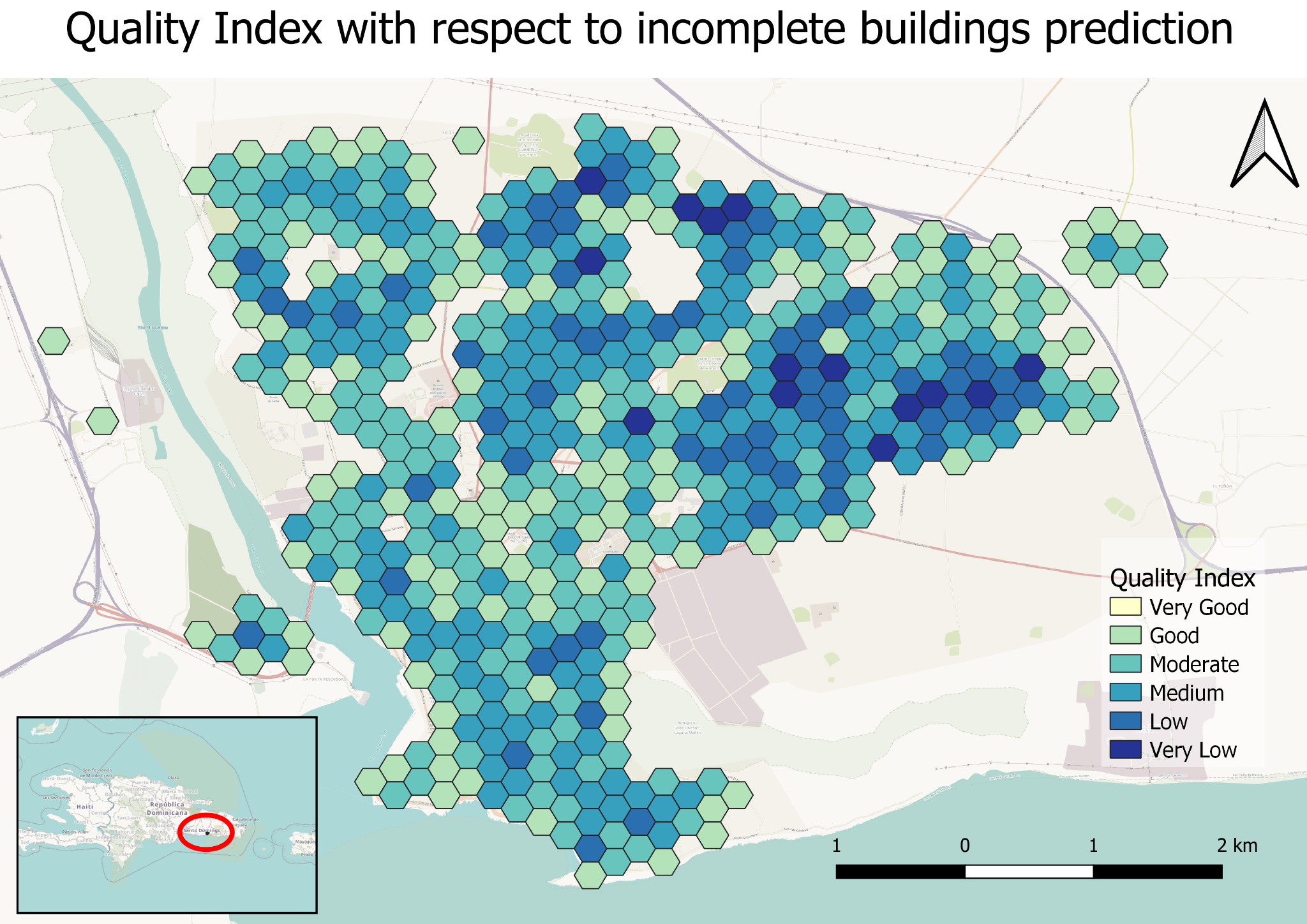
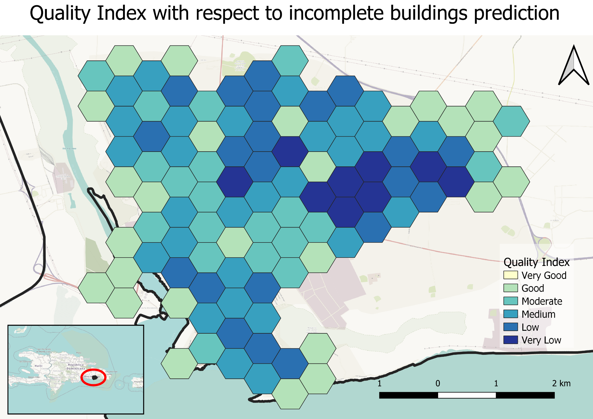
I tried the concept of inclusive visualisation by looking at the completeness aspect of the quality. This means I visualised the areas where there is possible incomplete data in OSM. Now there is one more thing, that is the regional context. If we would like to see the state of the data in OSM which has geographical and regional elements attached to it, we need to first realise the fact that context is a very important variable to consider while envisioning the quality. I choose two case-studies to show-case to visualise this concept: SAN PEDRO DE MACORÍS, Dominican Republic and La Parguera, Puerto Rico. I focused on the context of disaster or stressors for both case-studies.
Case for “there is always another way”
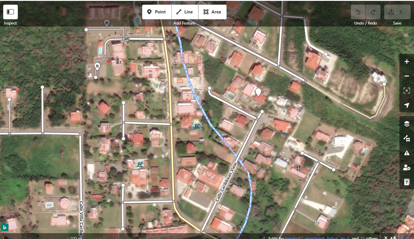
In La Parguera the impending disaster is an earthquake. The data for building footprints is fairly complete from the manual inspection from the available satellite imagery. One of the information that is required for the earthquake response is the material and age of the building to estimate the vulnerable buildings.
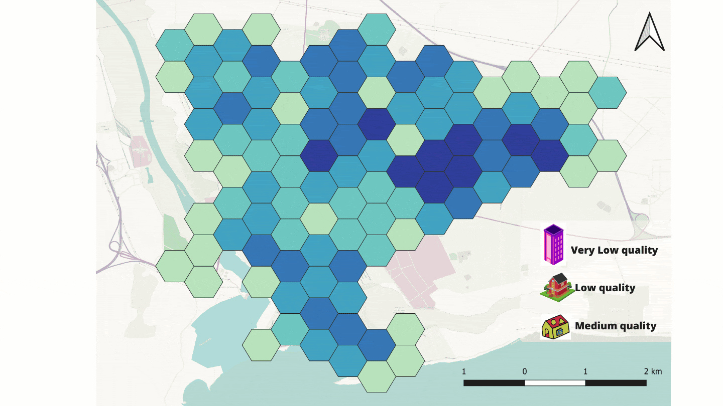
I discovered that La Parguera is a very nice tourist hotspot, which means a source of income for the local population. Displaying the missing information and mentioning it explicitly could do a possible harm by reducing the tourist visiting the location, eventually reducing the livelihood for the local population. What I learned from this analysis was that the quality of OSM can best work in combination with model thinking in order to make the visualisation inclusive. Keeping this causal relationship in mind, I developed a criteria that if the building polygons in OSM does not have more than one information tag will be considered as low quality. I followed two simple steps:
- I extracted all the mapped buildings and buildings with more than one tag.
- I counted the total buildings and buildings with more than one tag, accumulate it into hexagonal polygons, and divide them to formulate the quality index.
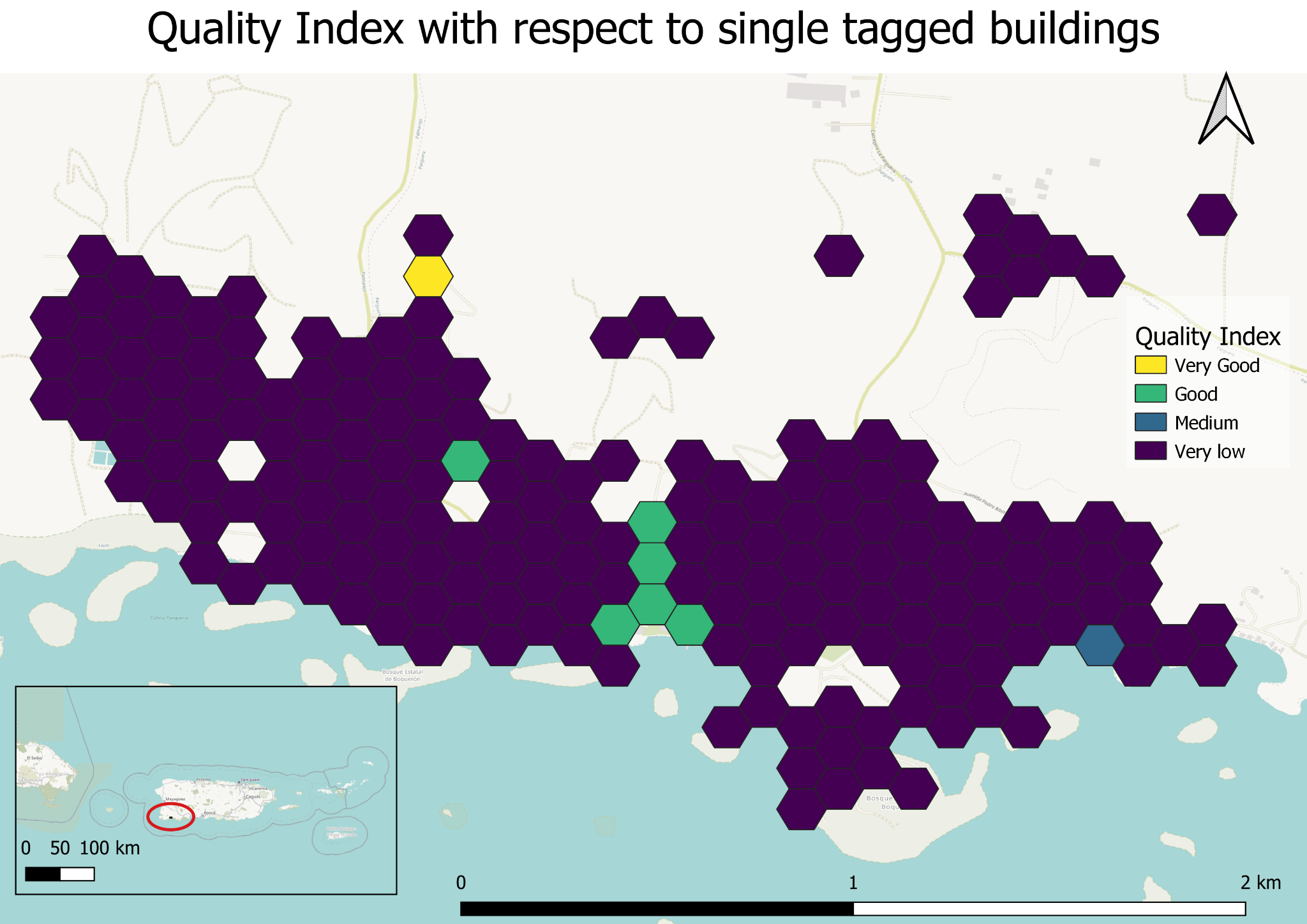
Two types of visualisation came into picture. One of the learning points from previous case-study was the colours scheme was contradictory with the colours of water bodies. First I choose different colour palettes but still inclusive for colorblinds. Now getting back to the outcomes Fig 3A is for individuals in the field of GIS or data science and volunteers, Fig 3B shows how it can be emphasized for individuals in other disciplines. Reason for choosing only one scale (larger) for Fig 3A, because in my opinion the workload for this is focused on getting ground information such as age and building material from the field surveys. It would only make sense to divide the task in larger chucks for better management. But again this is an opinion and can be challenged and feedback would be of utmost importance.
Lessons learned
- There are always different ways to make our (geo)visualisation more inclusive.
- Different sizes of hexagons makes the visualisation more action-based for different actors
- If we combine model thinking into (geo)visualisation we can make it further inclusive.
- Colors of your feature class should not contradict the colors of your base map (should have known), but it is important to mention because many colorblind friendly color palettes do contradict and care should be taken.
- Context is highly important to build your visualisation to follow the “do-no-harm” principle.
- There is always another way to visualise the state of your data to reduce the unintentional tangible and intangible damages.
Made with the support of the Risk & Resilience DAT/Artathon 2021.
Comments