So you like scrolling? Why not learn while you do it

With great curiosity—and frankly, a ton of envy—I like reading interactive articles from The New York Times. Their stunning colors and visualizations are only supplemental to the attention to detail in the way information is given. Thus, the DAT/Artathon workshop was THE perfect excuse to create my first storymap. Here’s the story of how I did it.
Why scrollytelling?
My goal with the DAT/Artathon was to find a way to explain the motivation behind my Ph.D. research. Having something that isn’t too technical and is easily shareable improves the impact of your work. I see the storymap that I made (a form of scrollytelling) as an introduction to a paper; a way to easily grasp the goals and importance of the research before fully reading it. I highly recommend storymaps.
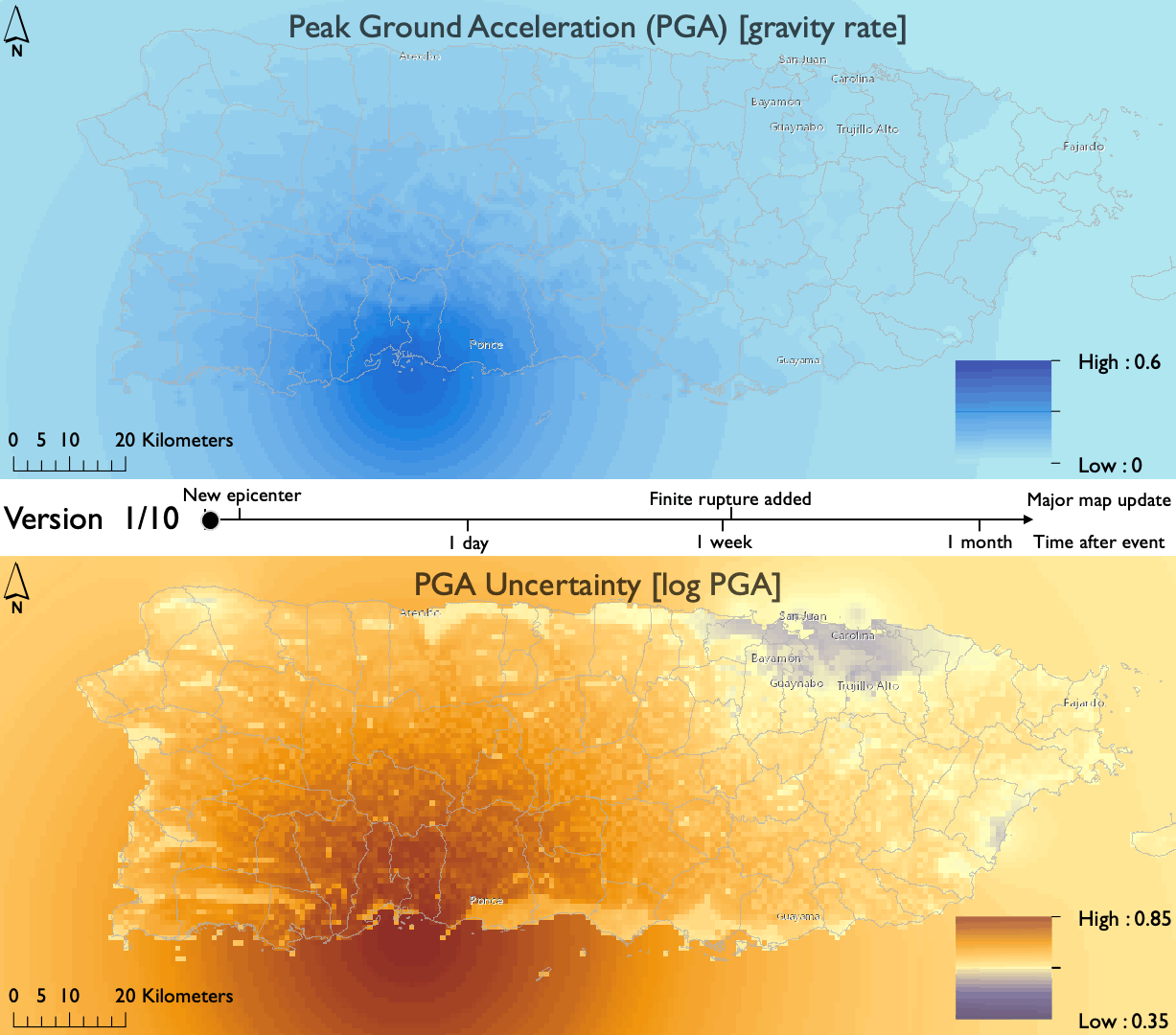
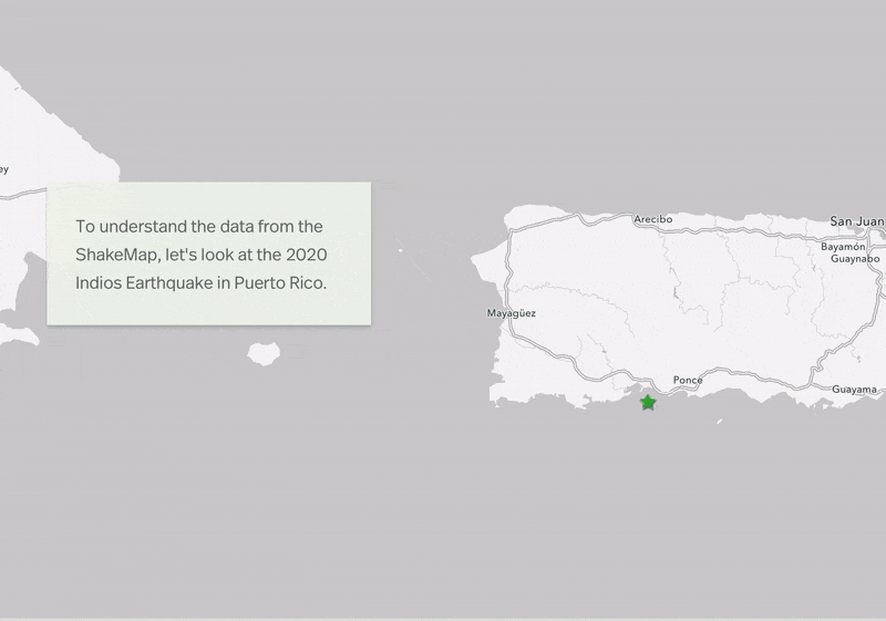
For you to understand why I needed a storymap, I’ll briefly explain what I’m working on. In short, immediately after an earthquake, a large amount of data is collected to understand the severity of the ground motion. This data can then be used to estimate the level of damage of affected buildings. The problem is this data is very sparse given the impossibility of having sensors and data points everywhere. As a result, there are multiple uncertainties involved when collecting information for earthquakes. My work focuses on quantifying these uncertainties and how they evolve in time, given that the amount of information increases over time and ground motion estimations improve. Moreover, I am interested in connecting the evolution of these estimations with the damage assessment of several types of buildings, and its effect on economic loss. Therefore, since large earthquakes occur over massive regions, having different types of maps helps to understand multiple characteristics of damage assessment. Also, there are multiple data sources used during this stage, and thus, there are multiple ways to visualize them.
In light of this, scrollytelling was the appropriate media form, since it can merge data visualizations, text, and maps as you scroll down the article. And of course, it looks clean and sophisticated. This tool allows the reader to read at their own pace, without worrying about pausing a video to read something, or just using text to imagine what’s written. Since I knew I wanted to include maps and data for my work, I had to try it out.
My journey during the workshop
I must be clear. I didn’t do this on my own. The DAT/Artathon workshop gave me the right tools and inspiration to build my own storymap. I had the chance to constantly discuss my project with multiple people from various backgrounds. It all started with the analog drawing, where we look at the grand scope of our projects. The figure below shows my first vision for the project.
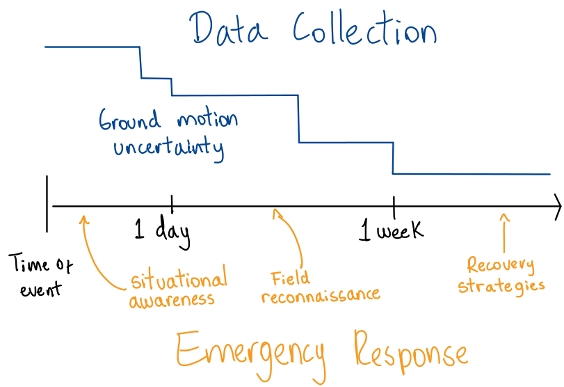
At this point, I decided to merge the evolution of ground motion uncertainty with the emergency tasks done during the response to a disaster. Scrollytelling presented the possibility to update maps and include text to reference key points on each map.
The next stage for my project was building an outline. This was helpful to not only frame the scope of the project but also give a reasonable timeline to complete it during the workshop. Note that I started sketching the chapters and figures I wanted to include. Also, I still didn’t know how technical I wanted my story to be.
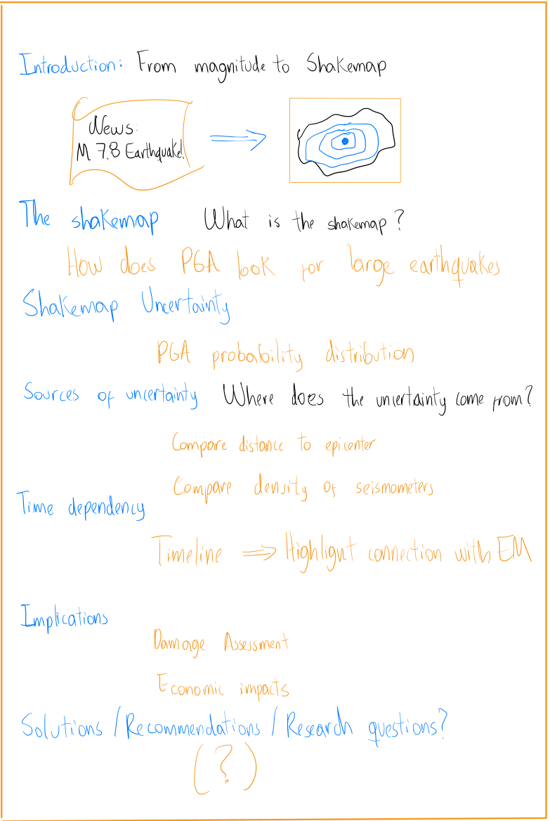
Going a step further, I built a script. I want to remind you that we had constant feedback from the organizers and the other members of my cohort. This was very helpful to understand how other people, with different backgrounds, interpret the information you are showing. For this script, I separated different types of media, for instance, the images I wanted to include, the types of maps, the text, and the chapters. I decided to remove all equations to just focus on the intricacies of earthquake data collection. If people are interested, the full paper provides technical details.
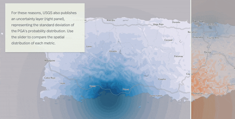
After finishing the script, I started building the actual maps. This was more research-specific since I already had the data and knew perfectly what region and variables to show. However, I experimented with different types of map visualizations such as the slider and a GIF to highlight the dynamics of ground motion.
Now comes the fun part. Since I had experience with ArcGIS, I had heard of a way to make scrollytelling with your maps. This was the easiest transition I could make given my time constraints for the workshop. If you have the chance to work with ESRI’s maps, I highly suggest using storymaps to develop a scrollytelling story. It is user-friendly, there is no need to code, and it’s free.
The end product
So here it is, my storymap. I hope you learn something from it. You can reach out if you have questions about story maps, map-making, or earthquakes in general!
Click here to view my storymap in full screen.
Made with the support of the Risk & Resilience DAT/Artathon 2021.
Comments