Dataviz: Going Big for Mass Media (James Goldie)

In July 2022, we had our first seminar of the DAT/Artathon Seminar Series. We were excited to kick off this series with a presentation on developing data visualizations on climate and disasters for the media by James Goldie, Data and Digital Storytelling Lead for 360info.
About James Goldie
James Goldie is the Data and Digital Storytelling Lead for 360info, a research-driven newswire supported by Monash University. As a data journalist, James undertakes data analysis and visualisation in partnership with 360info’s academic authors, and builds tools to help editors and journalists use maps, charts, and interactives in their stories. See more of James’s work here: https://jamesgoldie.dev/.
Dataviz: Going Big for Mass Media
Communicating to mass audiences is a good way for disaster researchers to affect change through their work. But whether it’s through broadcast, digital or other media, mass audiences are tricky to work with. In his talk, James walked us through quick, actionable strategies that can help make dataviz easier to read and absorb for large audiences. He covered the context of dataviz, and provided some key considerations when working together with different actors—journalists and producers—on the ground.
Resources from James’s talk
- James shared the slides from his presentation on his website: https://jamesgoldie.dev/career/talks/datartahon-2022/
- The code for a lot of the visualization projects from 360info are also openly available at their Github: https://github.com/360-info.
- You can check out James’s full presentation below!
About the DAT/Artathon Speaker Series
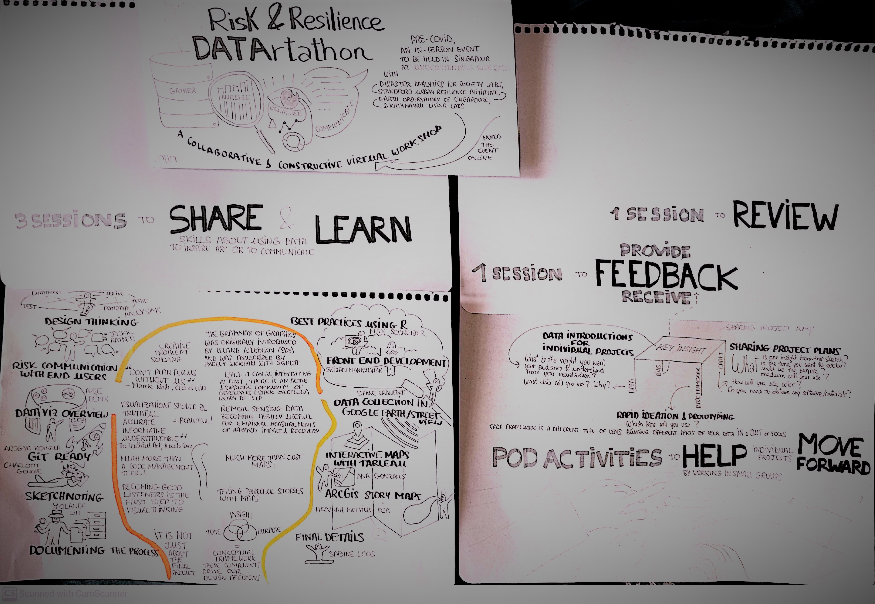
The DAT/Artathon speaker series will be held periodically throughout the year on the third Thursday of the month. Please check back on our EventBrite page to see upcoming speakers–we’ll feature a selection of speakers who are shaping data visualization regarding risk, resilience, natural hazards, or climate change.


Comments